Weekly reports (2024-04-01)
Choose the type of report you wish do view using the dropdown menu. The Model reports shows the recent forecasts and performance of the ensemble or individual models, whereas the Country reports shows model-by-model performance, either overall or by country. The reports get updated every Tuesday.
European COVID-19 Forecast Hub Evaluation Report for epiforecasts-EpiNow2
Latest forecasts
No recent forecasts to show. Click the Forecast tab above to view all past forecasts.
Predictive performance
Skill is shown as weighted interval score.
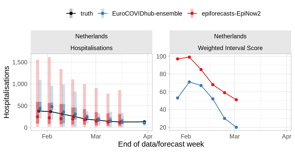
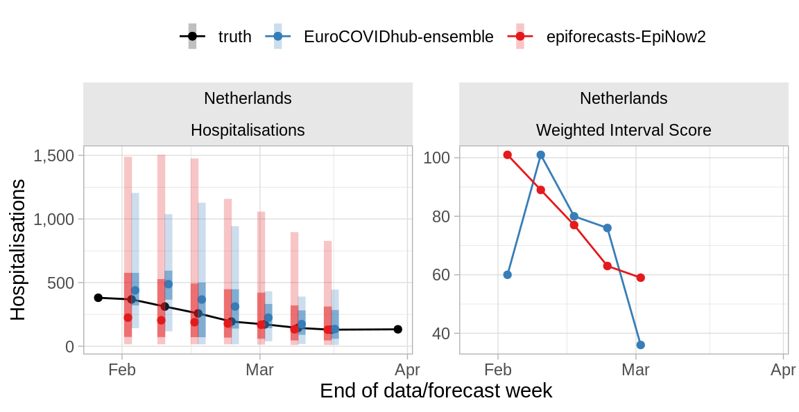
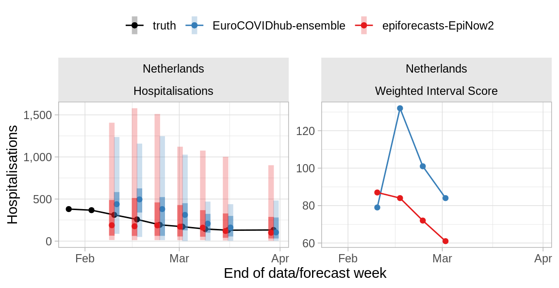
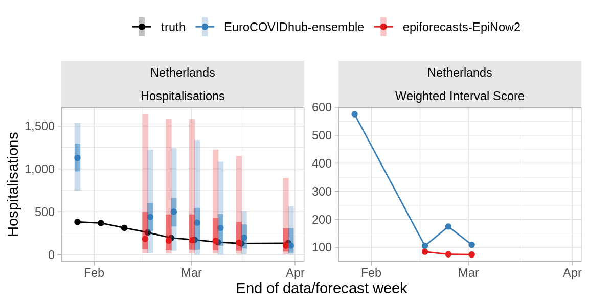
Hospitalisations
1 week ahead horizon
Overall predictive performance
The table shows the skill of the epiforecasts-EpiNow2 model relative to the baseline (vs. baseline) and the ensemble model (vs. ensemble) for the past 10 weeks in terms of the Weighted Interval Score (WIS) and Absolute Error (AE). Values less than 1 indicate the model performs better than the model it is being compared with, and values greater than 1 that it performs worse. WIS values are only shown if all 23 quantiles are provided.
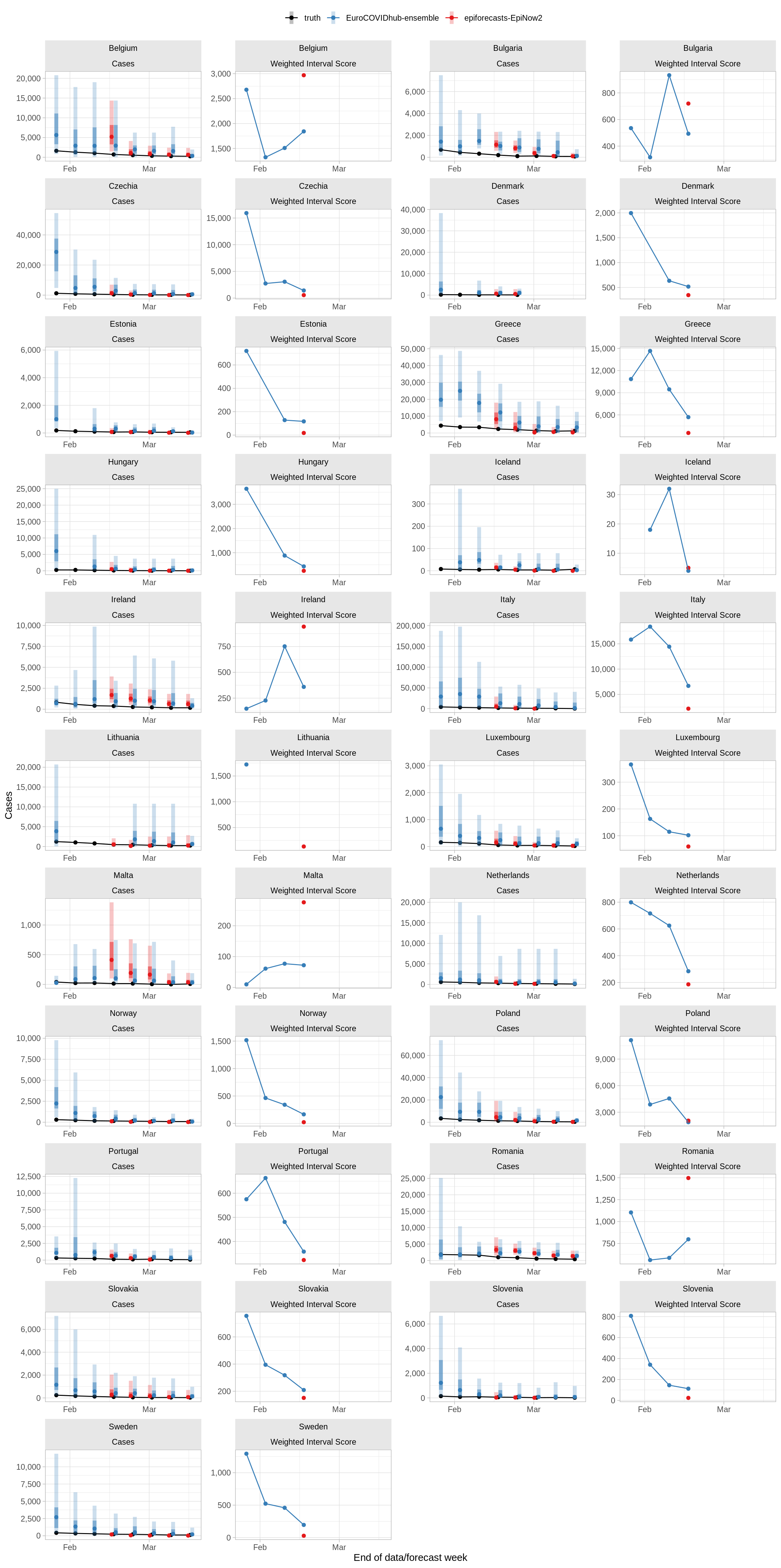
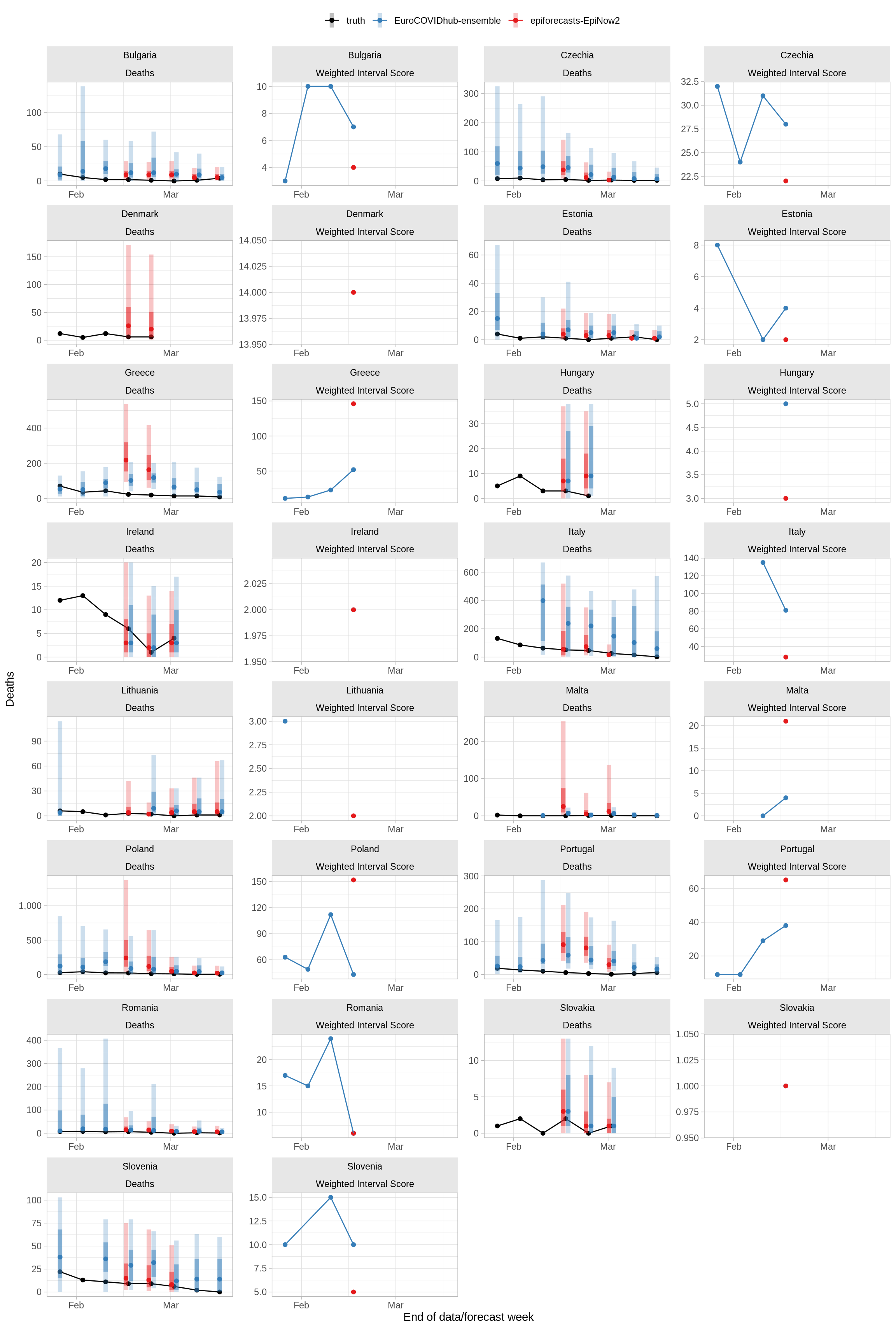
Performance over time
The plots below show the data and forecasts with 50% and 90% predictive intervals and, in the panel to the right of the data plots, forecast skill as measured by the Weighted Interval Score. Lower values indicate better predictive performance.
2 weeks ahead horizon
Overall predictive performance
The table shows the skill of the epiforecasts-EpiNow2 model relative to the baseline (vs. baseline) and the ensemble model (vs. ensemble) for the past 10 weeks in terms of the Weighted Interval Score (WIS) and Absolute Error (AE). Values less than 1 indicate the model performs better than the model it is being compared with, and values greater than 1 that it performs worse. WIS values are only shown if all 23 quantiles are provided.
Performance over time
The plots below show the data and forecasts with 50% and 90% predictive intervals and, in the panel to the right of the data plots, forecast skill as measured by the Weighted Interval Score. Lower values indicate better predictive performance.
3 weeks ahead horizon
Overall predictive performance
The table shows the skill of the epiforecasts-EpiNow2 model relative to the baseline (vs. baseline) and the ensemble model (vs. ensemble) for the past 10 weeks in terms of the Weighted Interval Score (WIS) and Absolute Error (AE). Values less than 1 indicate the model performs better than the model it is being compared with, and values greater than 1 that it performs worse. WIS values are only shown if all 23 quantiles are provided.
Performance over time
The plots below show the data and forecasts with 50% and 90% predictive intervals and, in the panel to the right of the data plots, forecast skill as measured by the Weighted Interval Score. Lower values indicate better predictive performance.
4 weeks ahead horizon
Overall predictive performance
Overall scores are only created for models that were used for forecasts in each of the last 4 weeks, excluding periods during which there were anomalies in the data. At the moment the model does not fulfill that criterion.
Performance over time
The plots below show the data and forecasts with 50% and 90% predictive intervals and, in the panel to the right of the data plots, forecast skill as measured by the Weighted Interval Score. Lower values indicate better predictive performance.
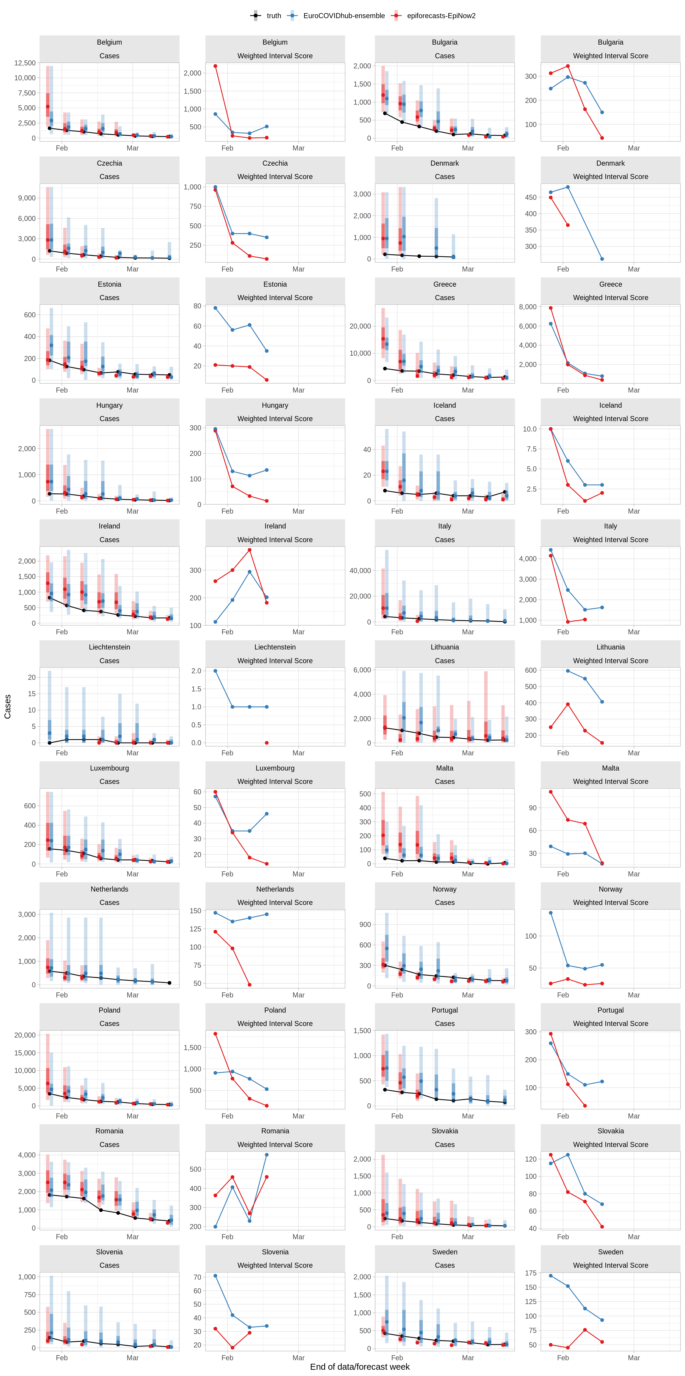
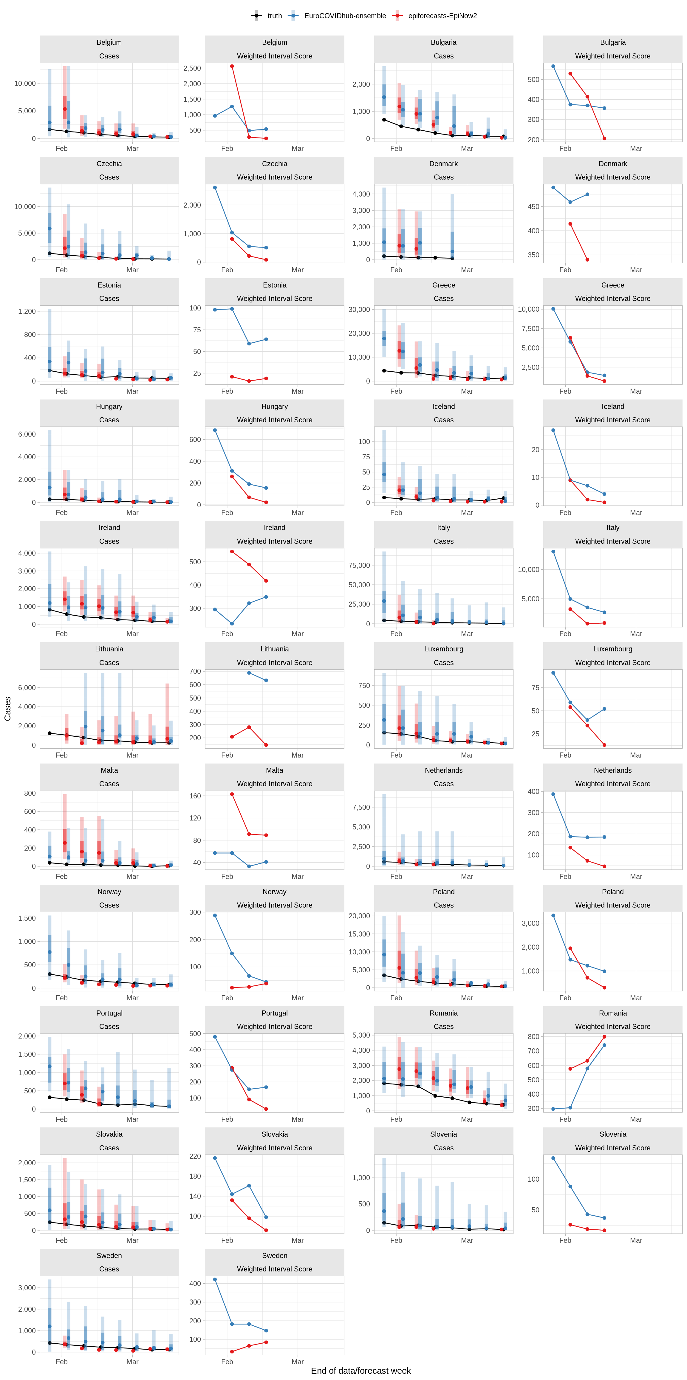
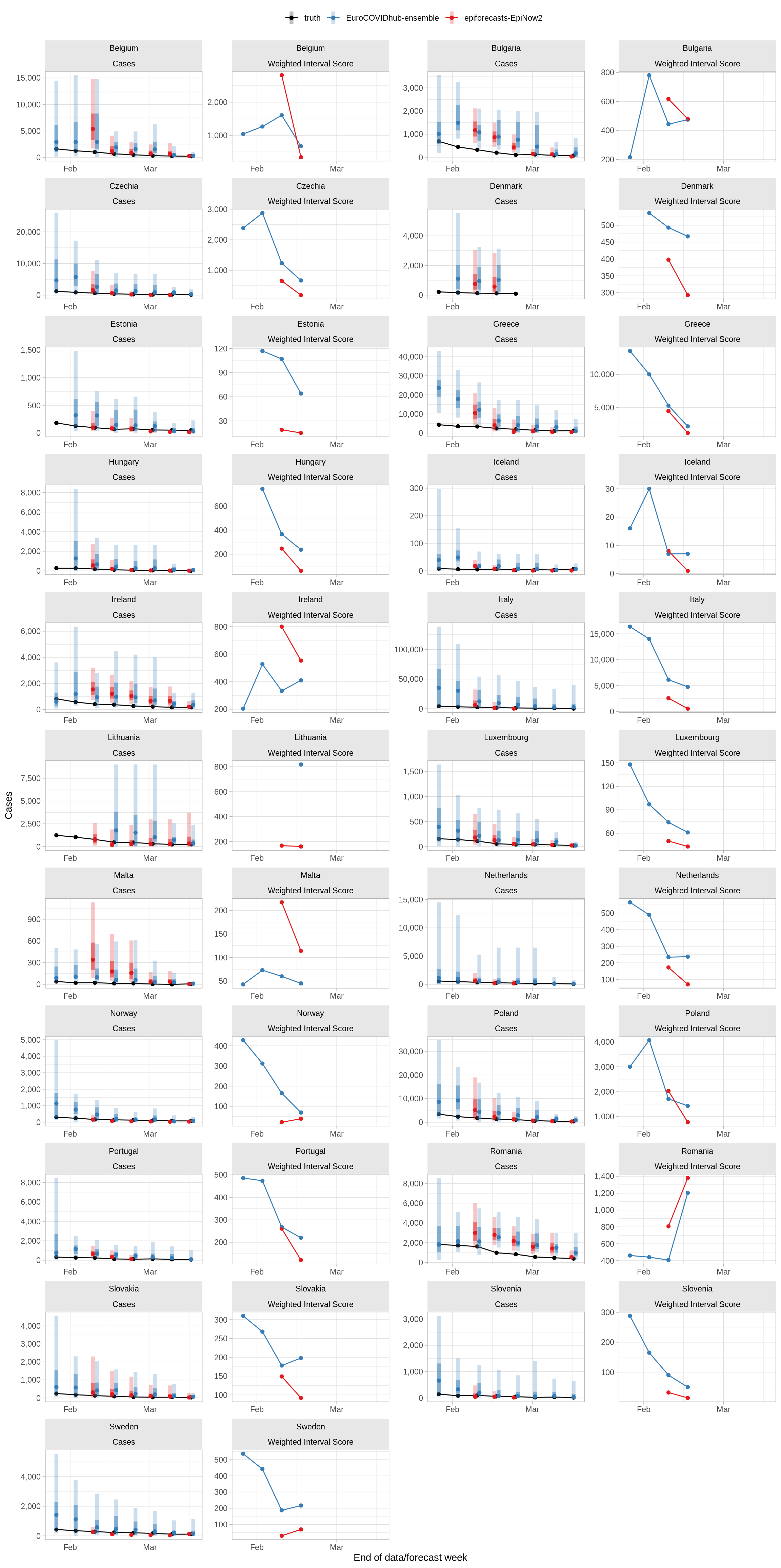
Cases
1 week ahead horizon
Overall predictive performance
The table shows the skill of the epiforecasts-EpiNow2 model relative to the baseline (vs. baseline) and the ensemble model (vs. ensemble) for the past 10 weeks in terms of the Weighted Interval Score (WIS) and Absolute Error (AE). Values less than 1 indicate the model performs better than the model it is being compared with, and values greater than 1 that it performs worse. WIS values are only shown if all 23 quantiles are provided.
Performance over time
The plots below show the data and forecasts with 50% and 90% predictive intervals and, in the panel to the right of the data plots, forecast skill as measured by the Weighted Interval Score. Lower values indicate better predictive performance.
2 weeks ahead horizon
Overall predictive performance
Overall scores are only created for models that were used for forecasts in each of the last 4 weeks, excluding periods during which there were anomalies in the data. At the moment the model does not fulfill that criterion.
Performance over time
The plots below show the data and forecasts with 50% and 90% predictive intervals and, in the panel to the right of the data plots, forecast skill as measured by the Weighted Interval Score. Lower values indicate better predictive performance.
3 weeks ahead horizon
Overall predictive performance
Overall scores are only created for models that were used for forecasts in each of the last 4 weeks, excluding periods during which there were anomalies in the data. At the moment the model does not fulfill that criterion.
Performance over time
The plots below show the data and forecasts with 50% and 90% predictive intervals and, in the panel to the right of the data plots, forecast skill as measured by the Weighted Interval Score. Lower values indicate better predictive performance.
4 weeks ahead horizon
Overall predictive performance
Overall scores are only created for models that were used for forecasts in each of the last 4 weeks, excluding periods during which there were anomalies in the data. At the moment the model does not fulfill that criterion.
Performance over time
The plots below show the data and forecasts with 50% and 90% predictive intervals and, in the panel to the right of the data plots, forecast skill as measured by the Weighted Interval Score. Lower values indicate better predictive performance.
Deaths
1 week ahead horizon
Overall predictive performance
The table shows the skill of the epiforecasts-EpiNow2 model relative to the baseline (vs. baseline) and the ensemble model (vs. ensemble) for the past 10 weeks in terms of the Weighted Interval Score (WIS) and Absolute Error (AE). Values less than 1 indicate the model performs better than the model it is being compared with, and values greater than 1 that it performs worse. WIS values are only shown if all 23 quantiles are provided.
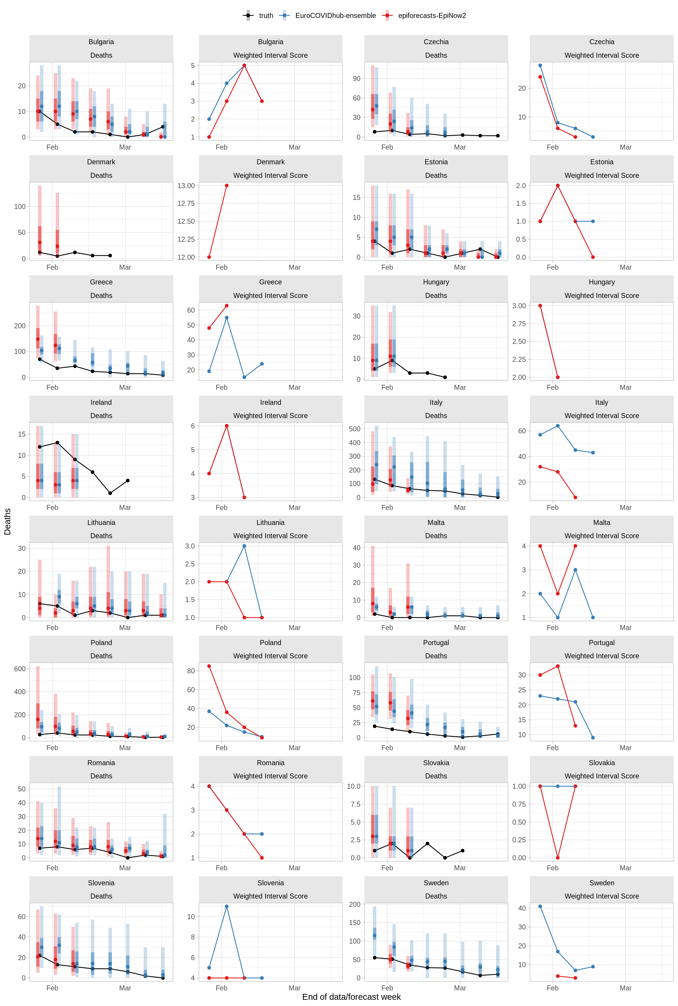
Performance over time
The plots below show the data and forecasts with 50% and 90% predictive intervals and, in the panel to the right of the data plots, forecast skill as measured by the Weighted Interval Score. Lower values indicate better predictive performance.
2 weeks ahead horizon
Overall predictive performance
Overall scores are only created for models that were used for forecasts in each of the last 4 weeks, excluding periods during which there were anomalies in the data. At the moment the model does not fulfill that criterion.
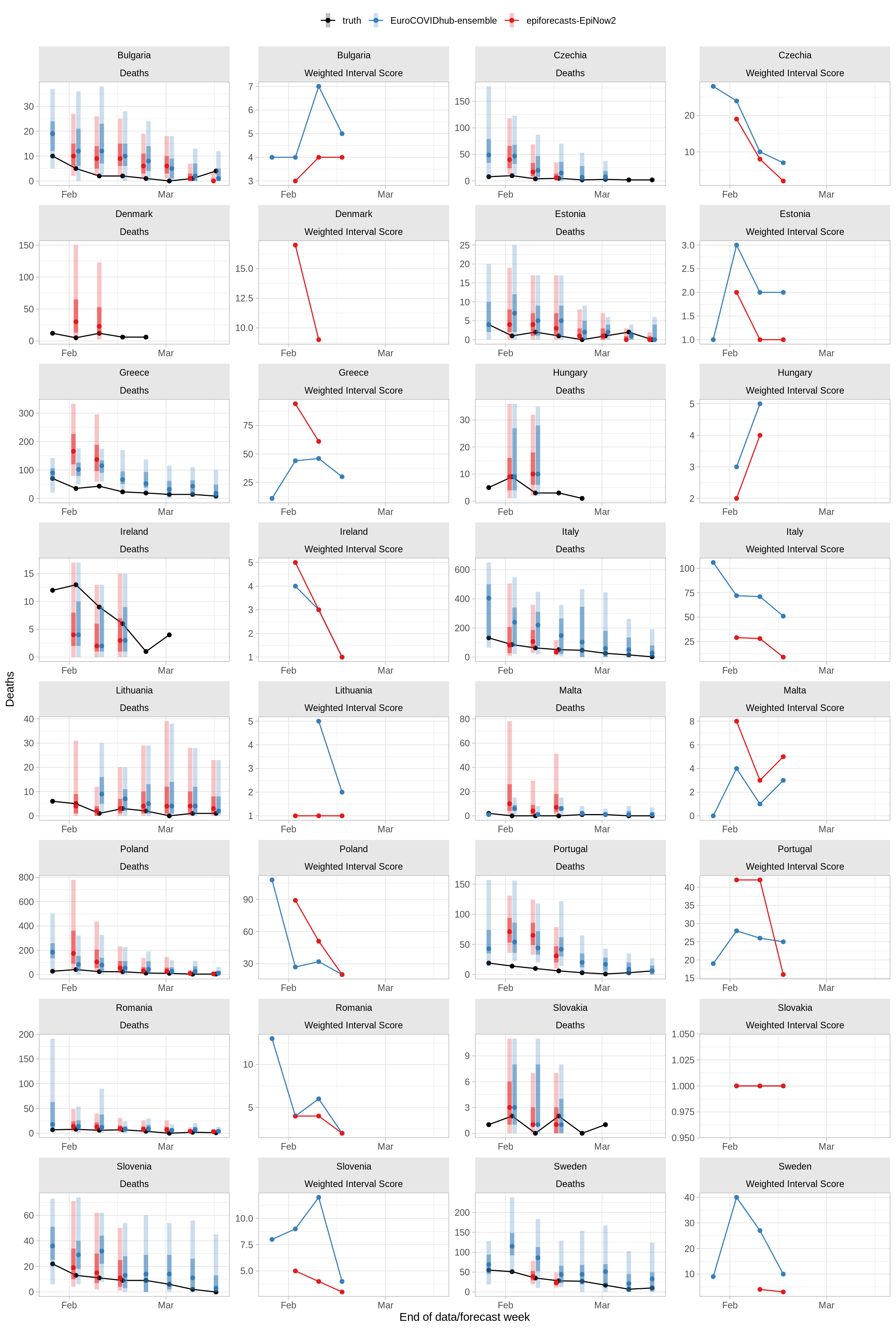
Performance over time
The plots below show the data and forecasts with 50% and 90% predictive intervals and, in the panel to the right of the data plots, forecast skill as measured by the Weighted Interval Score. Lower values indicate better predictive performance.
3 weeks ahead horizon
Overall predictive performance
Overall scores are only created for models that were used for forecasts in each of the last 4 weeks, excluding periods during which there were anomalies in the data. At the moment the model does not fulfill that criterion.
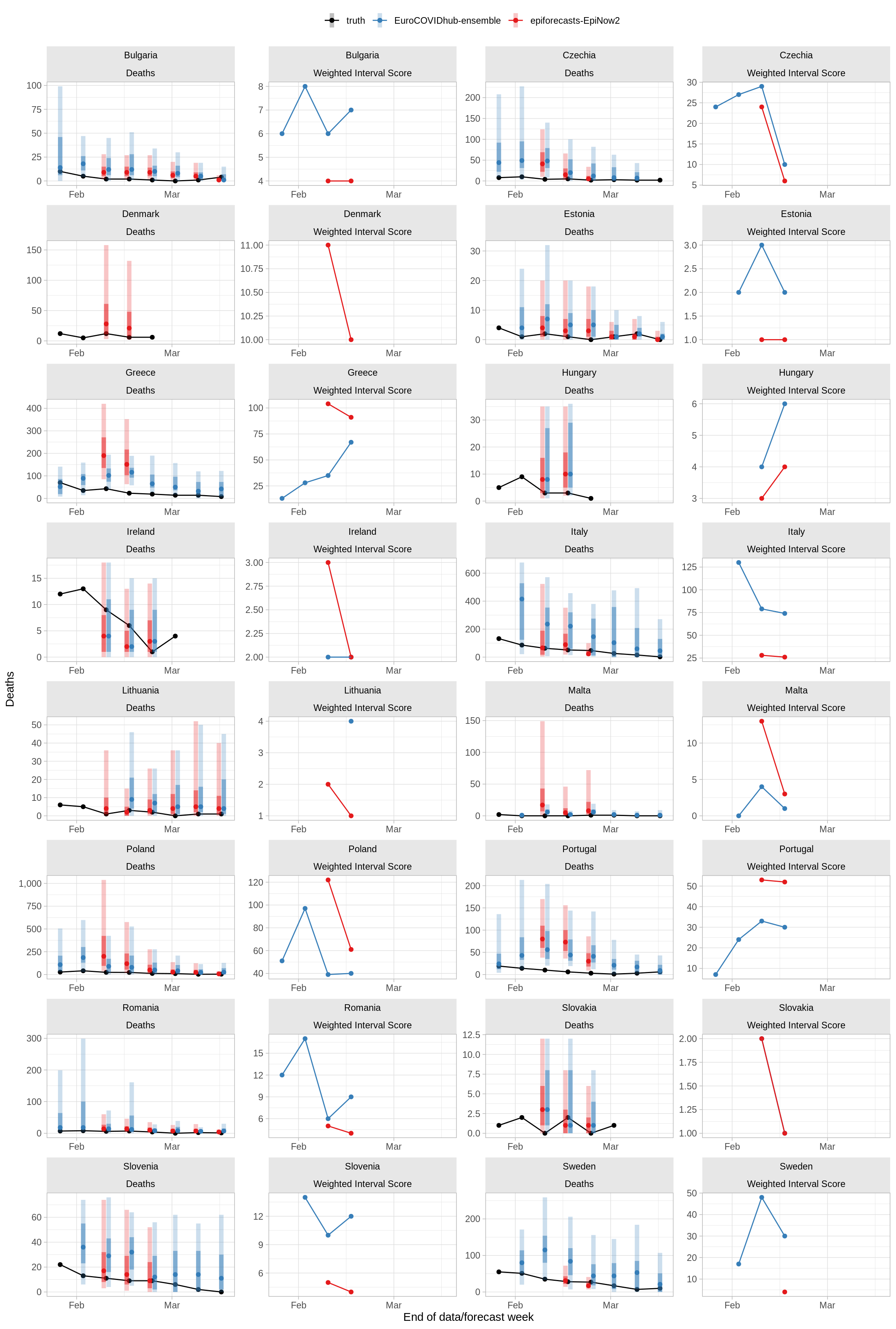
Performance over time
The plots below show the data and forecasts with 50% and 90% predictive intervals and, in the panel to the right of the data plots, forecast skill as measured by the Weighted Interval Score. Lower values indicate better predictive performance.
4 weeks ahead horizon
Overall predictive performance
Overall scores are only created for models that were used for forecasts in each of the last 4 weeks, excluding periods during which there were anomalies in the data. At the moment the model does not fulfill that criterion.
Performance over time
The plots below show the data and forecasts with 50% and 90% predictive intervals and, in the panel to the right of the data plots, forecast skill as measured by the Weighted Interval Score. Lower values indicate better predictive performance.
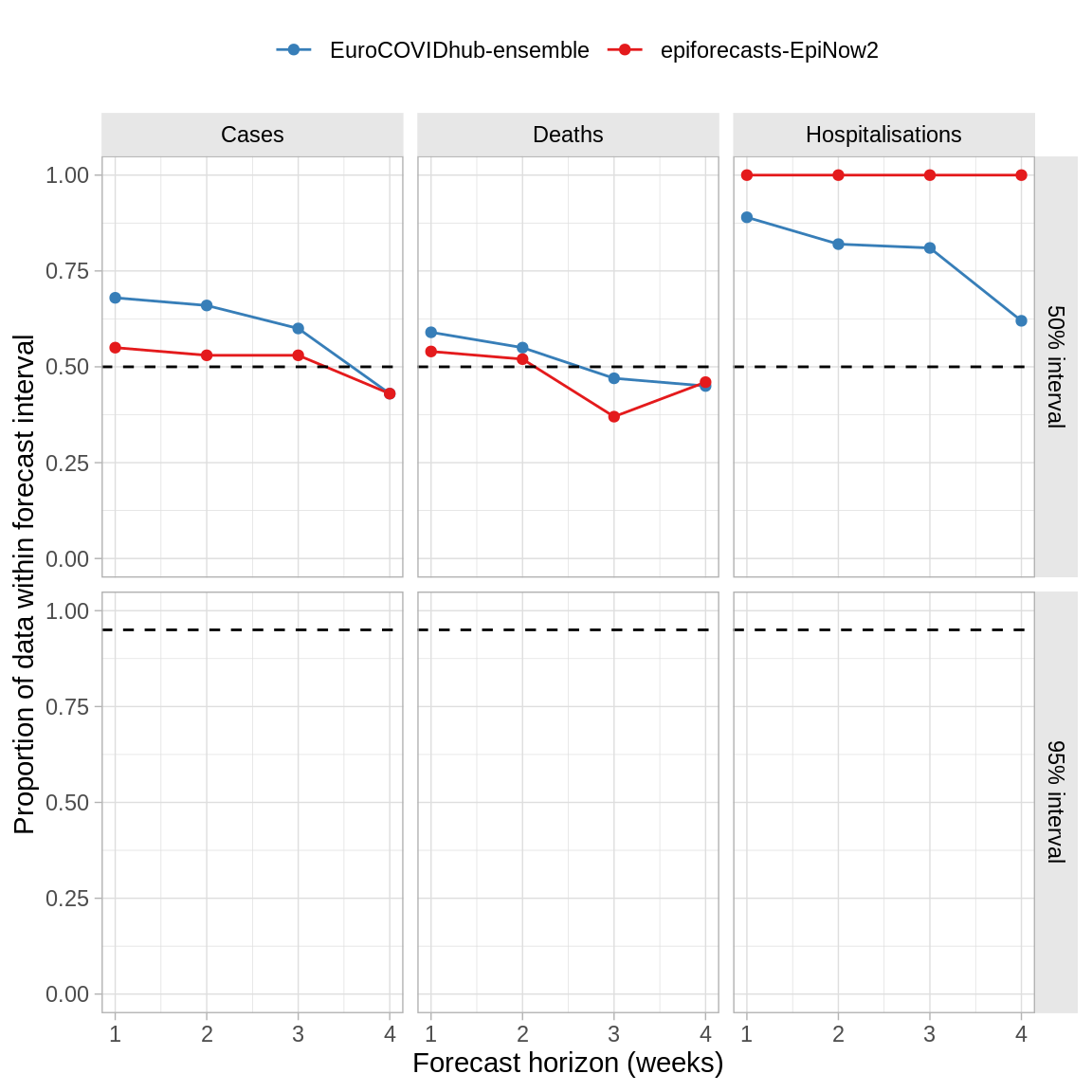
Forecast calibration
The plots below describe the calibration of the model, that is its ability to correctly quantify its uncertainty, across all predicted countries.
Overall coverage
Coverage is the proportion of observations that fall within a given prediction interval. Ideally, a forecast model would achieve 50% coverage of 0.50 (i.e., 50% of observations fall within the 50% prediction interval) and 95% coverage of 0.95 (i.e., 95% of observations fall within the 95% prediction interval), incidcated by the dashed horizontal lines below. Values of coverage greater than these nominal values indicate that the forecasts are underconfident, i.e. prediction intervals tend to be too wide, whereas values of coverage smaller than these nominal values indicate that the ensemble forecasts are overconfident, i.e. prediction intervals tend to be too narrow.
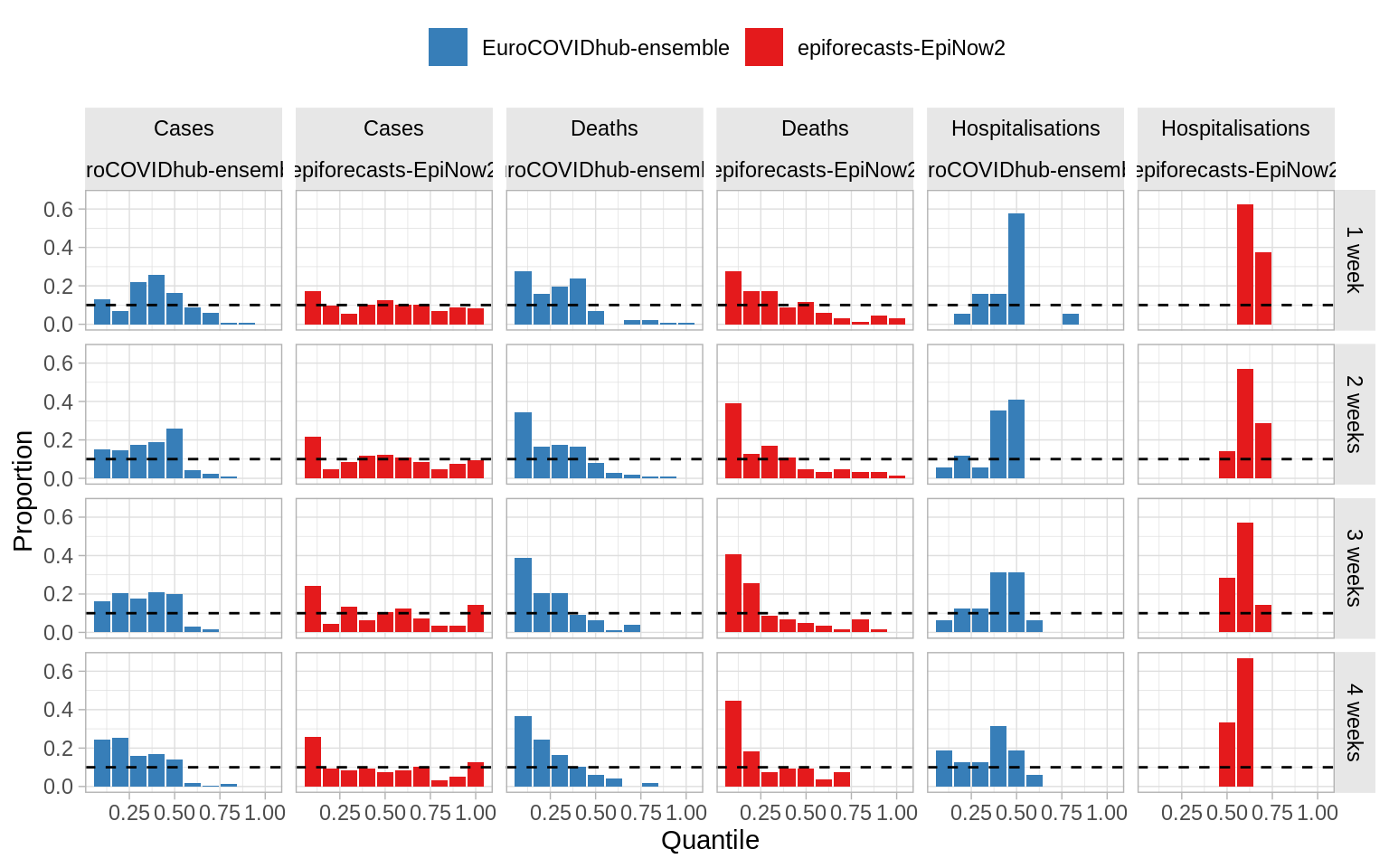
PIT histograms
The figures below are PIT histograms for the all past forecasts. These show the proportion of true values within each predictive quantile (width: 0.1). If the forecasts were perfectly calibrated, observations would fall evenly across these equally-spaced quantiles, i.e. the histograms would be flat.